Visualizing the Mean-Variance Trend in the Eevee Dataset

What data types are you visualizing?
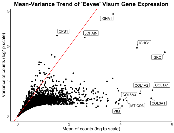
I am visualizing quantitative and categorical data. The quantitative data is the mean and variance of gene expression for all genes, while the categorical data being expressed is a handful of the names of genes with high mean and/or variance.
What data encodings (geometric primitives and visual channels) are you using to visualize these data types?
The visual channel I am using to visualize the quantitative variables of mean and variance of gene expression is position, where the x-axis shows the mean of gene counts and the y-axis shows the variance of gene counts. The geometric primitive used for the quantitative variables are points.
For the the categorical data of individual gene names, the visual channel I am using is position to express which point correspond to which gene name. I would argue there is not really a geometric primitive used here, however I heavily rely on Gestalt’s principle of enclosure (there is a border around the gene names) to draw the viewer’s eye to the high mean/variance genes.
What about the data are you trying to make salient through this data visualization?
My data visualization aims to make more salient the high mean and/or variance genes within the spatial transcriptomics visium data. Ideally, this plot aims to inform the analyst of what genes might be of interest in downstream analysis or spatial plotting of this spatial transcriptomics data.
What Gestalt principles or knowledge about perceptiveness of visual encodings are you using to accomplish this?
The main Gestalt principle I am utilizing is enclosure, where gene names are enclosed with a box next to the point that represents that gene. Another Gestalt principle I use is proximity to ensure viewers know which point corresponds to which gene name. Finally, one could say I use Gestalt’s principle of continuity by plotting a red line with intercept 0 and slope 1 to express what the 1:1 relationship of the mean to variance ratio would look like in this plot. The red line also aids in expressing to viewers the x and y axes are not on the same scale (their range differs).
NOTE: I log1p my data to make the visualization more salient/legible :)
### HW1 ###
## Caleb Hallinan ##
## Eevee sequencing data ##

# import libraries
library(here)
library(ggplot2)
library(tidyverse)
library(ggrepel)

# read in data
data = read.csv(here("data/eevee.csv.gz"), row.names = 1)

# QC
dim(data)
head(data)
colnames(data)
rownames(data)

# grab only genes and expression
X = data |>
  select(!c(barcode, aligned_x, aligned_y))

# log1p transform data
X = log1p(X)

# get mean and variance for each gene
mean_genes <- apply(X, 2, mean)
var_genes <- apply(X, 2, var)

# combine mean and variance into a data frame
mean_var_df <- data.frame(mean_genes, var_genes)

# add gene names as a column
mean_var_df$genes <- rownames(mean_var_df)
rownames(mean_var_df) <- NULL

# set seed for ggrepel
set.seed(44)

# plot
ggplot(mean_var_df) +
  # geom point for mean/variance
  geom_point(aes(x = mean_genes, y = var_genes)) +
  geom_abline(intercept = 0, slope = 1, color = "red") +
  # label high variance genes
  geom_label_repel(aes(x = mean_genes, y = var_genes, label=ifelse(var_genes>2, as.character(genes),'')),
                   box.padding   = 0.35,
                   point.padding = 0.5,
                   segment.color = 'grey50') +
  # label high mean genes
  geom_label_repel(aes(x = mean_genes, y = var_genes, label=ifelse(mean_genes>4, as.character(genes),'')),
                   box.padding   = 0.5,
                   point.padding = 0.5,
                   segment.color = 'grey50') +
  # theme
  theme_classic() +
  # labels
  labs(
    x = "Mean of counts (log1p scale)",
    y = "Variance of counts (log1p scale)",
    title = "Mean-Variance Trend of 'Eevee' Visum Gene Expression"
    ) +
  # text edit
  theme(
    plot.title = element_text(hjust = 0.5, face="bold", size=18),
    text = element_text(size = 14)
  )