CCDC80 spatial expression

What data types are you visualizing?
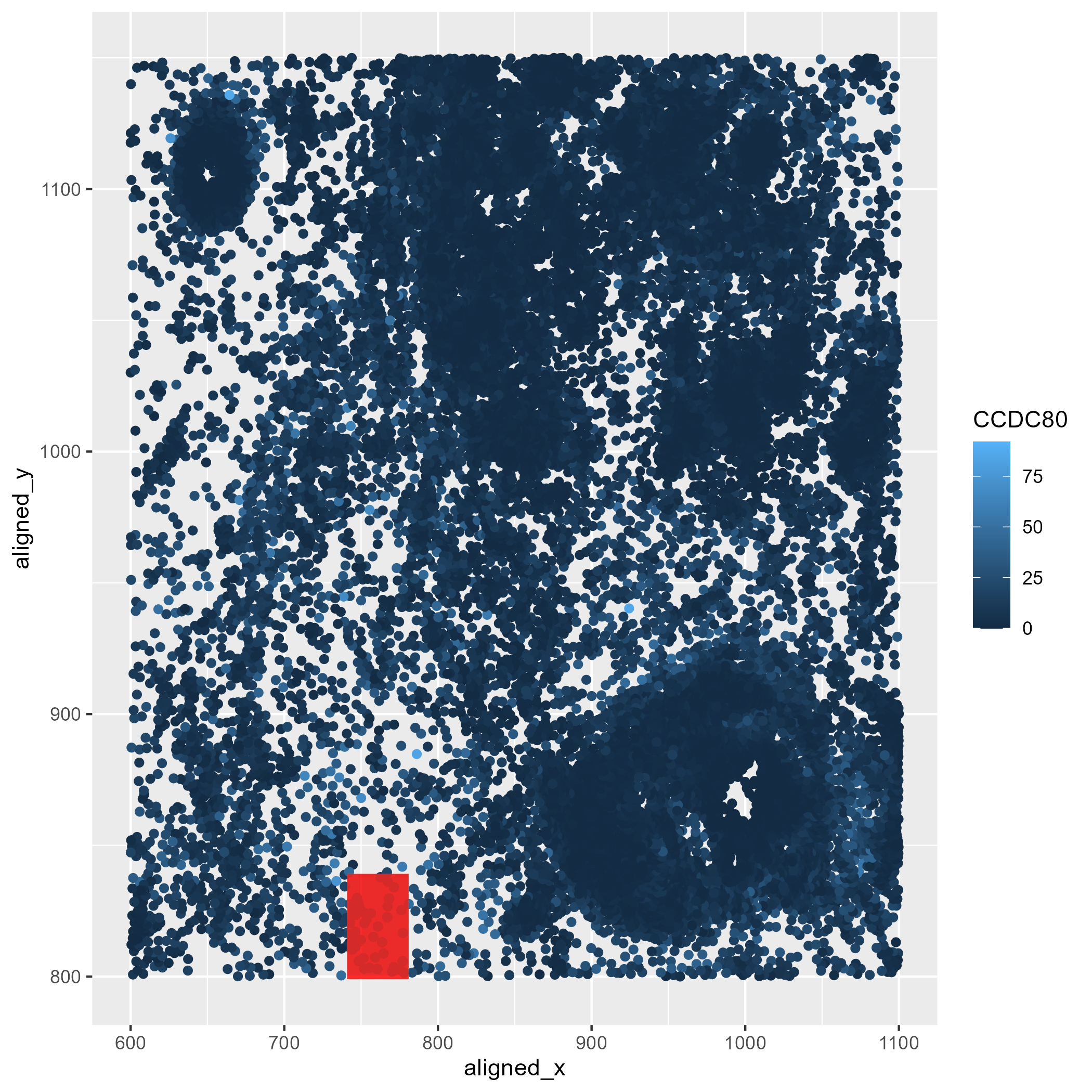
In the following plot, quantitative data of the expression count of the CCDC80 gene for each cell was generated. X and Y coordinates were computed as spatial data to locate these CCDC80 gene expression locations.
What data encodings (geometric primitives and visual channels) are you using to visualize these data types?
In the following plot, I used geometric primitive of points to represent each cell’s x and y coordinates. For the CCDC80 expression level, visual channel of color saturation was implemented, with the lightest shades of blue used to map locations containing higher expression values. Lastly, the geometric primitive of area, the visual channels of shape and color to locate the highest CCDC80 expression value in the data.
What about the data are you trying to make salient through this data visualization?
This visualization highlights in the red box the region of the spatial field that has the highest expression of the CCDC80 gene.
What Gestalt principles or knowledge about perceptiveness of visual encodings are you using to accomplish this?
In the following plot, the Gestalt principle of enclosure was implemented by overlaying a transparent rectangle over the region containing the highest CCDC80 expression. This allowed to standout this location from the background and other cells. I also used the principle of similarity by using the same shape for all the cells.
library(ggplot2)

outpth <-'~/genomic-data-visualization-2024/homework/hw1/'

file <- '~/genomic-data-visualization-2024/data/pikachu.csv.gz'
data <- read.csv(file)

head(data)


# Get coordinates of max CCDC80 region
max_region <- data[which.max(data$CCDC80), c("aligned_x", "aligned_y")]
xmin <- max_region$aligned_x[1] - 20
xmax <- max_region$aligned_x[1] + 20
ymin <- max_region$aligned_y[1] - 20
ymax <- max_region$aligned_y[1] + 20

im_xy_genes<- ggplot(data)+
  geom_point(aes(x=aligned_x,y=aligned_y,
             col=CCDC80)) +
  geom_rect(aes(xmin = xmin, xmax = xmax, ymin = ymin, ymax = ymax),
            fill = "red", alpha = 0.01)

ggsave(paste0(outpth, "hw1_aperei13.png"), plot = im_xy_genes)