Spatial variation in proportion of genes expressed in smFISH

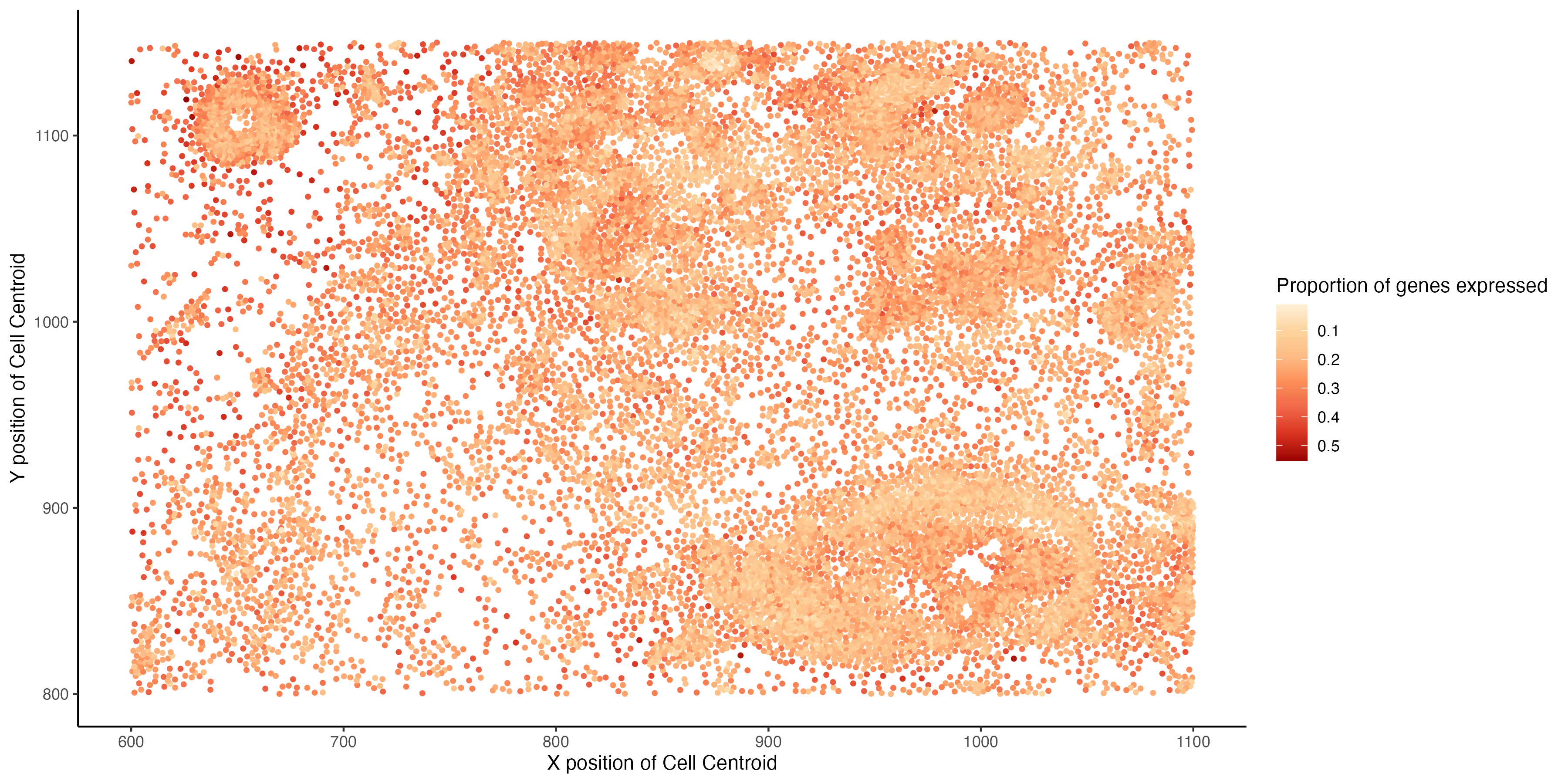
I am visualizing the spatial variation of the proportion of total number of genes expressed by a cell. The proportion is computed for each cell as the number of genes with non-zero expression, divided by the total number of genes in the data (313).
What data types are you visualizing?
The data types visualized are quantitative ( the proportion of genes that are expressed by a cell ) and spatial (x and y positions of the centroid of a cell).
What data encodings (geometric primitives and visual channels) are you using to visualize these data types?
The geometric primitives used are points (for the spatial location of each cell) . The visual channels used are color (saturation) to indicate the proportion of genes expressed by a cell and position on the x-axis is used for the x coordinate of the cell centroid and position on the y-axis is used for y-coordinate of the cell centroid.
What about the data are you trying to make salient through this data visualization?
Through this visualization I am trying to emphasize the spatial pattern in the proportion of genes expressed, it can be observed that cells that are clustered closer spatially tend to express lesser number of genes than cells tat are scattered more spatially.
What Gestalt principles or knowledge about perceptiveness of visual encodings are you using to accomplish this?
I am using the Gestalt principle of similarity is used to visualize cells that express a similar proportion of genes.
library(dplyr)
library(tidyverse)
library(ggplot2)
library(RColorBrewer)


## Data Description
# Each row is a cell ~17000
# Columns are mainly genes ~300
# cell_area from segmentation :: estimated from dilating the cell areas
# nucleus_area from segmentation:: from DAPI segmentation
# aligned_x and aligned_y :: cell centroid positions
# tissue sections from breast cancer

## Set working directory path and read in data
setwd("/Users/archanabalan/Karchin Lab Dropbox/Archana Balan/Coursework/Spring2024/GDV/homework/")
data <- read.csv("./data/pikachu.csv.gz", row.names =1)

# Compute proportion of genes expressed by each cell
# Drop first 5 columns for this computation (cell_id, cell_area etc)
# Ref: https://stackoverflow.com/questions/69195934/count-number-of-non-zero-columns-for-each-row

total_genes = ncol(data[, -c(1:5)] )
data$gene_frac = (rowSums(data[, -c(1:5)] != 0)) / total_genes


## Plotting the spatial location of cells
## visualizing the proportion of genes expressed by each cell

# Ref: http://www.sthda.com/english/wiki/ggplot2-colors-how-to-change-colors-automatically-and-manually
# Ref: https://r-graph-gallery.com/38-rcolorbrewers-palettes.html
# Ref: https://stackoverflow.com/questions/57119146/how-to-fix-continuous-value-supplied-to-discrete-scale-in-with-scale-color-bre

hw1.plt = ggplot(data = data, aes (x = aligned_x, y = aligned_y)) +
  geom_point(aes(color=gene_frac), size = 0.9) +
  theme_classic() +
  xlab("X position of Cell Centroid") +
  ylab("Y position of Cell Centroid") +
  scale_color_distiller(palette = "OrRd", trans = "reverse",
                        name = "Proportion of genes expressed" )

ggsave("./HW1/hw1_abalan2.png", hw1.plt, width = 12, height = 6, units = "in")