A Spatial Plot of POSTN Levels in Breast Cancer Tissue

What data types are you visualizing?
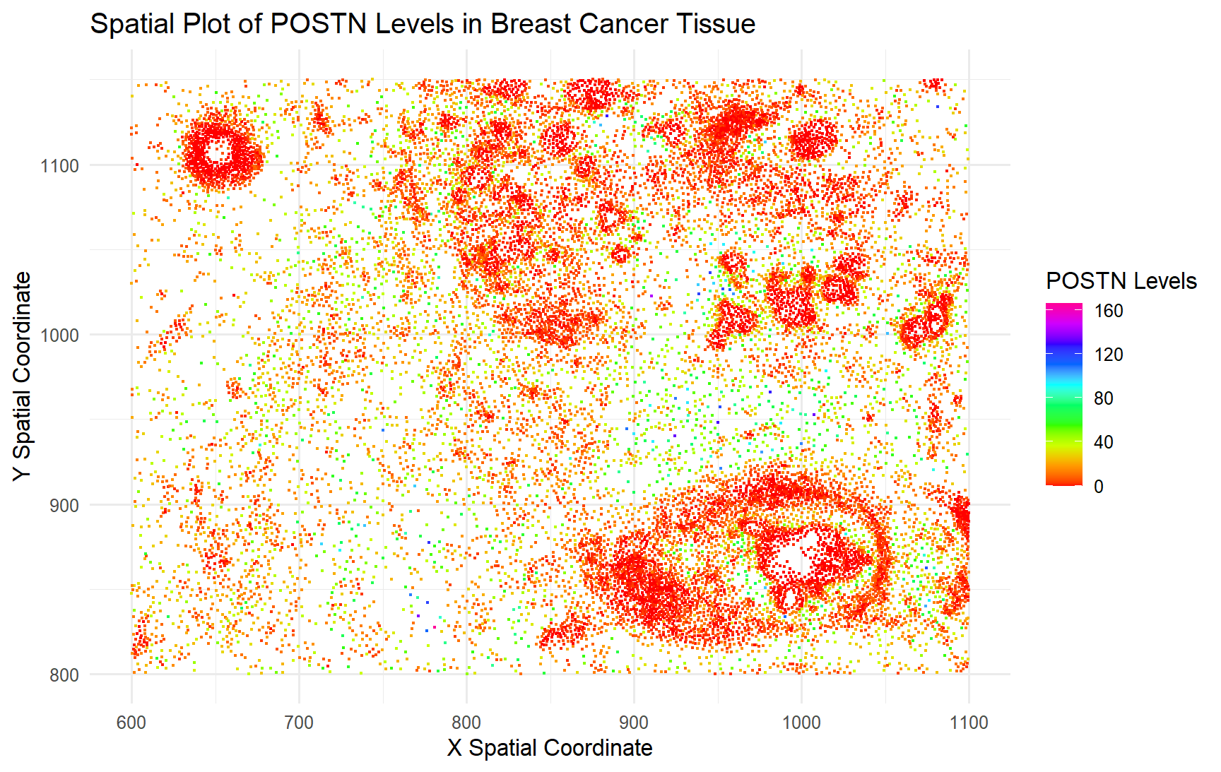
I wanted to visualize quantitative data in regards to the gene expression for POSTN, the most expressed gene on average across all the cells, and the spatial data which quantified where each of the cell’s centroid was located.
What data encodings (geometric primitives and visual channels) are you using to visualize these data types?
For this plot, I utilized the geometric primitive of points to represent each individual cell. To encode the spatial location of the cells in the tissue, I used the visual channel of position along the x and y axis to represent the location of the cell centroids in the tissue. To encode the gene expression levels of POSTN, I used the visual channel of color hues to represent different levels of expression/number of copies of the gene found.
What about the data are you trying to make salient through this data visualization?
My data visualization seeks to make more salient the relationship between POSTN expression and spatial location of the cells that do/don’t express POSTN in the tissue.
What Gestalt principles or knowledge about perceptiveness of visual encodings are you using to accomplish this?
I am using the Gestalt principle of proximity and similarity (of colors) to indicate that there are clusters of cells that don’t seem to express POSTN, even though it is the most expressed gene on average across the cells.
data <- read.csv('pikachu.csv.gz', row.names = 1)
dim(data)
colnames(data)

# look at the data, what are the columns, rows
# column1 = cell_ids, following columns are the cell characteristics
# each row is a cell, 17135 cells, and 317 characteristics
data[1:10, 1:10]

geneExpression <- data[,6:ncol(data)]
# nucleus area estimated from dapi segmentations
# cell area estimated from dilating from the nucleus
# aligned x and y are the cell centroid positions
# breast cancer tissue sections
# serial tissue section
# both datasets are looking at the same structure

# making the data visualization
# I want to plot the aligned_x, aligned_y, and have the color be the gene expression
library(ggplot2)

gene_mean_expression <- apply(geneExpression, 2, mean)

# Find the gene with the maximum mean expression
most_expressed_gene <- names(gene_mean_expression)[which.max(gene_mean_expression)]

print(paste("Most expressed gene:", most_expressed_gene))

ggplot(data) +
  geom_point(aes(x = aligned_x, y = aligned_y, color = POSTN), size = 0.3) +
  labs(title = "Spatial Plot of POSTN Levels in Breast Cancer Tissue",
       x = "X Spatial Coordinate",
       y = "Y Spatial Coordinate",
       color = "POSTN Levels") +
  scale_color_gradientn(colors = rainbow(10))+
  theme_minimal()