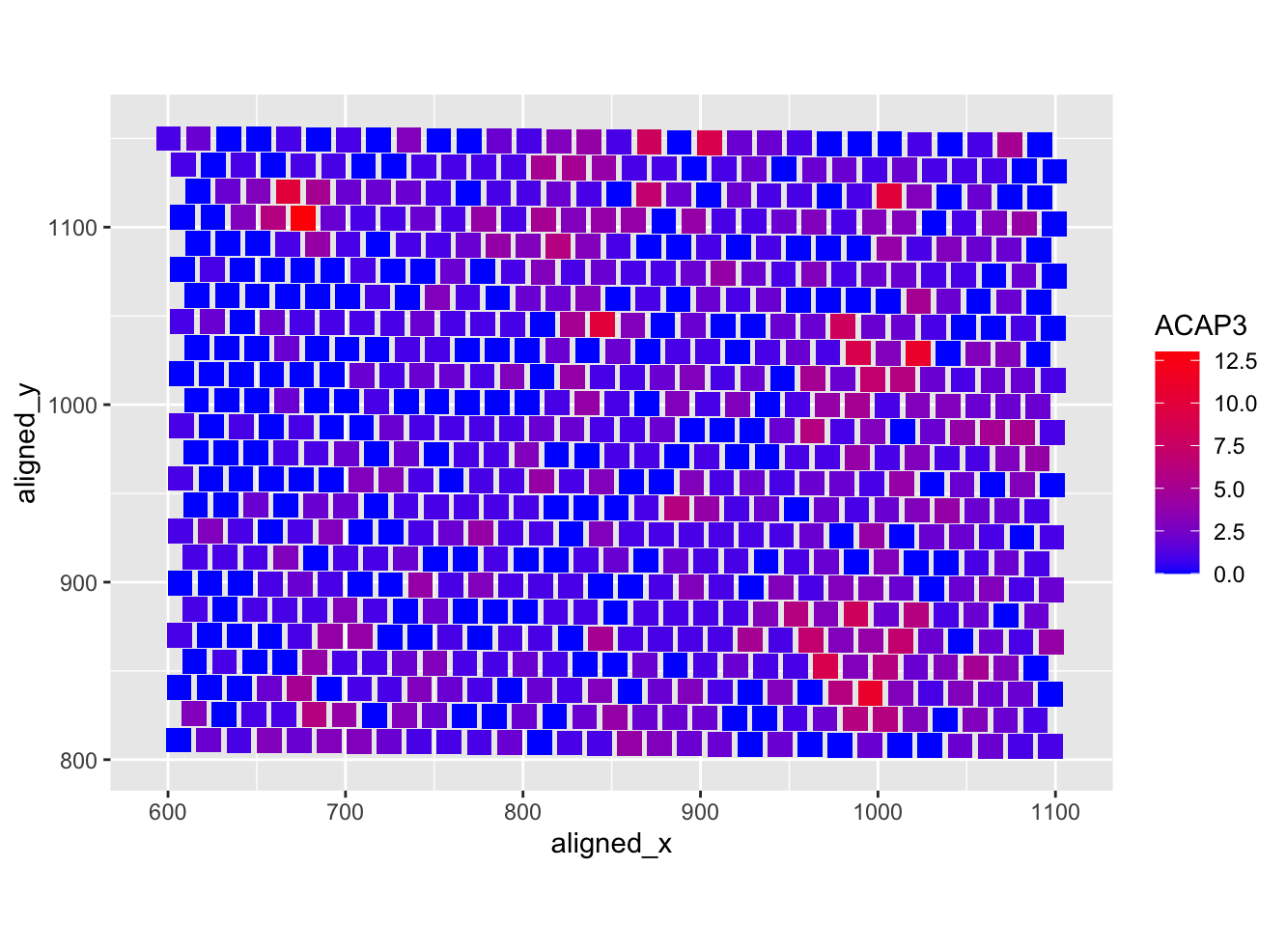
Heatmap of the ACAP3 gene

What data types are you visualizing?
I am visualizing quantitative data of the expression count of the ACAP3 gene within a single cell and spatial data regarding the x,y position for each bead within which the RNA count is measured.
What data encodings (geometric primitives and visual channels) are you using to visualize these data types?
I am using the geometric primitive of points to represent each bead. To encode expression count of the ACAP3 gene, I am using the visual channel of color hue from red to blue. To encode the spatial position of the bead, I am positioning the points along the x (600 to 1100) and y (800 to 1150) axis. Color hue from red to blue is also being used in the legend to encode expression count of the ACAP3 gene.
What about the data are you trying to make salient through this data visualization?
My data visualization seeks to make more salient the relationship between the density of ACAP3 gene expression count and the position within a cell.
What Gestalt principles or knowledge about perceptiveness of visual encodings are you using to accomplish this?
The principle of similarity is used to identify areas of similar ACAP3 gene expression density.
data2 <- read.csv('eevee.csv.gz', row.names = 1)
data <- data2
library(ggplot2)

ggplot(data, aes(x = aligned_x, y = aligned_y)) +
  #making the tiles, reference source: https://github.com/rstudio/cheatsheets/blob/main/data-visualization.pdf
  geom_tile(aes(fill = ACAP3, width = 14, height = 14)) +
  #square tiles, reference source: https://r-charts.com/correlation/heat-map-ggplot2/
  coord_fixed() +
  #color gradient, reference source: https://r-charts.com/correlation/heat-map-ggplot2/
  scale_fill_gradient(low = 'blue', high = 'red')