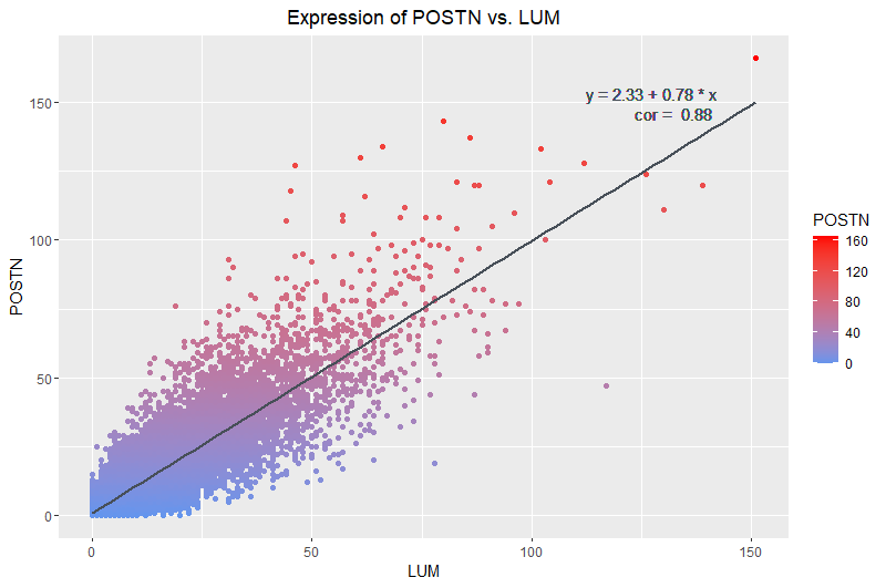
Relationship between LUM and POSTN Expression

What data types are you visualizing?
I am visualizing quantitative data of the expression counts of the LUM gene and its relationship to the expression counts of the POSTN gene.
What data encodings are you using to visualize these data types?
I am using the geometric primitive of points to represent each cell. To encode the count of each gene, I use the visual channel of position along their respective axes. To encode the increasing count of POSTN specifically, I am using the visual channel of color intensity to show increasing counts of POSTN represented by increased intensity of red.
What type of data visualization is this? What about the data are you trying to make salient through this data visualization? What Gestalt principles have you applied towards achieving this goal if any?
My data visualization seeks to make more salient the relationship between LUM gene expression count and POSTN gene expression count. The main Gestalt principle I used was continuity because dots aligned around the trendline I have added show that there is a visually detectable linear correlation between the expression counts of both genes. The reasoning for finding the pair of genes with the highest correlation was so that I could visualize the continuity of the points such that they form a group with a clear trend. Another Gestalt principle I used was proximity. The clustering of the points indicate to the viewer that the points belong to a group and exhibit a trend.
Please share the code you used to reproduce this data visualization.
# load the data
data <- read.csv('C:/Users/Amand/OneDrive/Documents/JHU-undergrad/Junior Year/Sem2/Genomic Data/Amanda-K/data/pikachu.csv.gz')
dim(data)
colnames(data)
head(data)

# install ggplot2
install.packages('ggplot2')
library(ggplot2)


best = 0

# find the highest pairwise correlation value
for (i in 2:318) {
  for (j in 3:319) {
    if (i == j) {
      next
    }
    tmp <- cor(data[[i]], data[[j]])
    if (tmp > best) {
      best <- tmp
      best_param1 <- colnames(data)[i]
      best_param2 <- colnames(data)[j]
      i_ = i
      j_ = j
    }
  }
}


# Visualize the Data

# find the trend line by running linear regression: source : chat gpt
lm_result <- lm(LUM ~ POSTN, data = data)

# Extract coefficients: source chat gpt --> asked it how to index the results
intercept <- coef(lm_result)[1]
slope <- coef(lm_result)[2]

ggplot(data) +
  scale_color_gradient(low ='cornflowerblue',high='red') +
  geom_point(aes(x=LUM,
                 y=POSTN,
                 col = POSTN)) + # plot POSTN count as color to visualize an increase in expression
  geom_smooth(aes(x=LUM, y=POSTN), method = "lm", formula = y ~ x, se = FALSE, color = "#474F58") +
  geom_text(aes(label = paste("y =", round(intercept, 2), "+", round(slope, 2), "* x")),
            x = max(data$POSTN), y = max(data$LUM), hjust = 1.8, vjust = 0, color = "#474F58") +
  geom_text(aes(label = paste("cor = ",
                              round(cor(LUM, POSTN), 2))),
            x = max(data$POSTN), y = max(data$LUM), hjust = 2.4, vjust = 1.5, color = "#474F58") +

  ggtitle('Expression of POSTN vs. LUM') +
  theme(plot.title = element_text(hjust = 0.5)) +
  theme(text=element_text(family="sans"))


# source for geom_text and theme --> chat gpt,I asked it how to add the equation of the line
# to the plot and also how to change the fonts