Visualizing Immune Cell Gene Expression-CD3E, and CD19

Scatter Plot
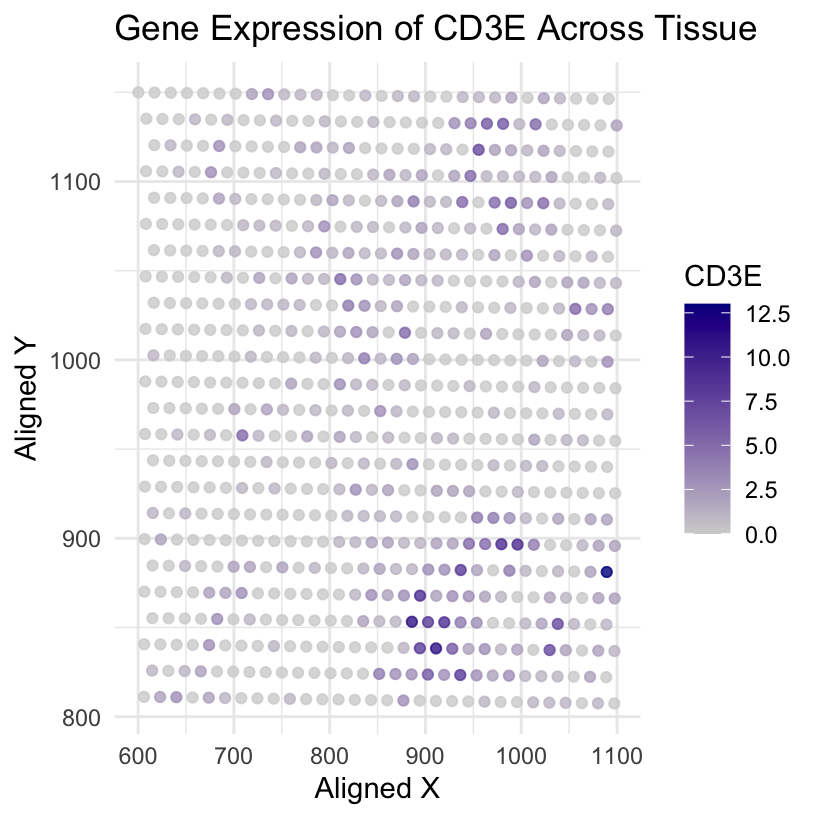
What data types are you visualizing?
I am visualizing quantitative data, gene expression levels of the CD3E and CD19, which are associated with T cells and B cells, respectively, gene across tissue samples.
What data encoding are you using to visualize these data types?
I am using the geometric primitive of points to represent individual tissue samples. The visual channel used is spatial position which is encoded by the aligned_x and aligned_y values. The color channel is employed to encode the gene expression levels.
What type of data visualization is this? What about the data are you trying to make salient through this data visualization?
This is a scatter plot. I aim to highlight the variations in CD3E and CD19 gene expression across tissues. The use of color as a visual channel draws attention to the differences in gene expression levels, and the spatial arrangement (position) of points aids in understanding the distribution across tissues.
What Gestalt principles have you applied towards achieving this goal if any?
Gestalt principles applied include Similarity and Proximity. Similarity: Points with similar color (gene expression) are perceived as related groups. Proximity: Points near each other (spatially) are perceived as related groups.
Violin Plots
What data types are you visualizing?
I am visualizing quantitative data, gene expression levels of the CD3E and CD19 genes across tissue samples.
What data encodings are you using to visualize these data types?
For the violin plots, I am using geometric primitives of areas in the form of violin plots to represent the distribution of gene expression levels. The visual channel used is position- x-axis encodes gene names categorically, and the y-axis encodes quantitative gene expression levels. Another channel is color that distinguishes between CD3E and CD19 genes.
What type of data visualization is this? What about the data are you trying to make salient through this data visualization?
These are violin plots. The aim is to emphasize the distributional characteristics of gene expression for CD3E and CD19 genes (immune cells). From the CD3E distribution we see higher height indicating the wider range of expression levels, and the narrower width suggests that there is a higher density of cells around certain expression levels.For CD19, the lower height indicates a narrower range of expression levels, and the wider width suggests a lower density of cells around those expression levels. The violin plot’s shape highlights the distributional characteristics of gene expression.
What Gestalt principles have you applied towards achieving this goal if any?
Gestalt principles used include Enclosure (violin plot surrounds the distribution) and Continuity (elements are perceived as smooth groups or continuous lines).
Please share the code you used to reproduce this data visualization.
#inference from the data
# Barcode: Unique identifier for each spot or cell.
# Aligned_x, Aligned_y: Coordinates or positions of the spots in a spatial context, which might represent the location of each cell in a tissue section.
# Genes: Each gene is represented by a column in the matrix.
# SAMD11, NOC2L, KLHL17, ... : These are gene names.


library(ggplot2)
data<- read.csv('/Users/nidhisoley/Desktop/Grad School-JHU/GDataViz/eevee.csv.gz', row.names=1
)
gene1 <- "CD3E"
gene2 <- "CD19"

##CD3E
ggplot(data, aes(x = aligned_x, y = aligned_y, color = gene1)) +
  geom_point(alpha=0.8) +
  scale_color_gradient(low = 'lightgrey', high = 'darkblue') +
  labs(title = "Gene Expression of CD3E Across Tissue",
       x = "Aligned X",
       y = "Aligned Y") +
  theme_minimal()

##CD19
ggplot(data, aes(x = aligned_x, y = aligned_y, color = gene2)) +
  geom_point(alpha=0.8) +
  scale_color_gradient(low = 'lightgrey', high = 'darkblue') +
  labs(title = "Gene Expression of CD19 Across Tissue",
       x = "Aligned X",
       y = "Aligned Y") +
  theme_minimal()

##Voilin plot
# Subset the data for the chosen genes
violin_data <- data[c("barcode", "aligned_x", "aligned_y", gene1, gene2)]

# Reshape the data
violin_data_long <- gather(violin_data, key = "Gene", value = "Expression", -barcode, -aligned_x, -aligned_y)

# Violin plots
ggplot(violin_data_long, aes(x = Gene, y = Expression, fill = Gene)) +
  geom_violin() +
  scale_fill_manual(values = c("#66c2a5", "#fc8d62")) +
  labs(title = "Violin Plots of Gene Expression",
       x = "Gene",
       y = "Expression Level") +
  theme_minimal()