VCAN Expression Count vs. Aligned X and Y Position for Sequencing Spatial Transcriptomic Dataset

What data types are you visualizing?
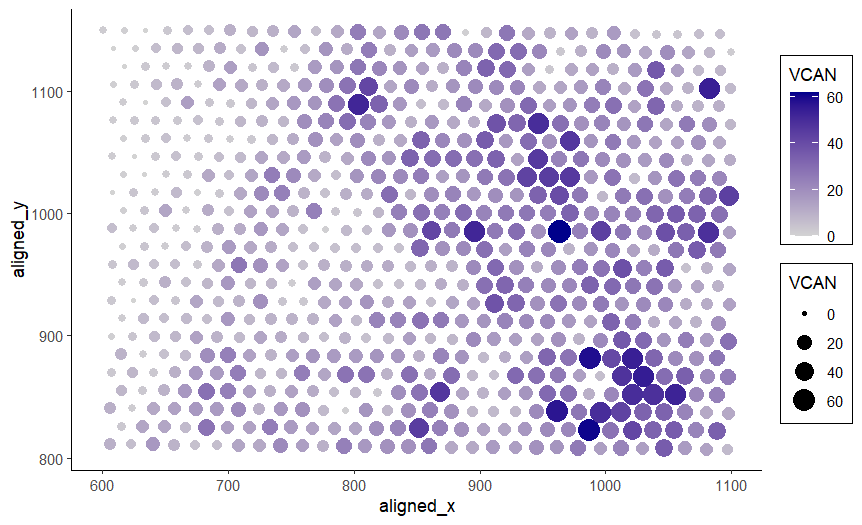
I am visualizing quantitative data of the expression count of the VCAN gene for each spot, and spatial data regarding the aligned x and y positions for each spot.
What data encodings are you using to visualize these data types?
I am using the geometric primitive of points to represent each spot on the spatial gene expression slide. To encode the spatial aligned x position, I am using the visual channel of position along the x axis. To encode the spatial aligned y position, I am using the visual channel of position along the y axis. To encode the quantitative expression count of the VCAN gene, I am using both the visual channel of saturation going from an unsaturated light grey to a saturated dark blue and the visual channel of area, going from smaller to larger size for increasing VCAN expression count.
These two visual channels were chosen because according to the data type chart, area has a better than average resolving time for quantitative data and saturation has a slightly worse than average resolving time for quantitative data. It is believed that in conjunction, leveraging both visual channels will increase saliency of the quantitative VCAN expression count. Additionally, saturation has a better resolving time for categorical data than area so it may help the viewer identify areas of common VCAN expression more easily. Note that while VCAN expression count is the main quantitative variable and so encoding it with the x or y axis position would have theoretically resulted in the best resolving time, this would require moving the spatial aligned x or y position encoding to a different visual channel. It was judged that doing this would decrease the saliency of the position information more than the possible benefit because of how unintuitive it is to have spatial variables not encoded by position.
What type of data visualization is this? What about the data are you trying to make salient through this data visualization? What Gestalt principles have you applied towards achieving this goal if any?
This data visualization is a scatter plot. My explanatory data visualization seeks to make more salient the relationship between VCAN expression count and the aligned x and y position of the spot. Because the x and y positions of the spot correspond to locations and structures in the tissue sample, this data visualization can make more salient the relationship between VCAN expression and certain locations and structures in the tissue. I have applied the Gestalt principle of enclosure to separate the size and color encoding legend from the plot with boxes. The Gestalt principle of proximity is also present in the legend because the size and color keys are next to each other. The Gestalt principle of similarity is used to identify areas of high or low VCAN gene expression count, since they will have similar color saturation. For example, the bottom right is a saturated dark blue and an area of high VCAN gene expression while the top left is an unsaturated gray and an area of low VCAN gene expression.
Please share the code you used to reproduce this data visualization.
data <-
    read.csv("genomic-data-visualization-2024/data/eevee.csv.gz",
             row.names = 1)

library(ggplot2)

ggplot(data, aes(
    x = aligned_x,
    y = aligned_y,
    size = VCAN,
    col = VCAN,
)) +
    scale_colour_gradient(low = 'lightgrey', high = 'darkblue') +
    geom_point() +
    theme_classic() +
    # box around legend source: https://stackoverflow.com/questions/47584766/draw-a-box-around-a-legend-ggplot2
    theme(legend.background = element_rect(size = 0.5,
                                           colour = 1))