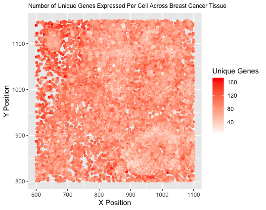
The Number of Unique Genes Expressed Per Cell Across a Breast Cancer Tissue Sample

What data types are you visualizing?
I am visualizing quantitative data of the number of unique genes expressed in each cell, as well as spatial data including the x and y centroid positions of each cell.
What data encodings (geometric primitives and visual channels) are you using to visualize these data types?
I am using points as the geometric primitive to represent each individual cell. I am encoding the spatial x position through the visual channel of position along the x axis. I am encoding the spatial y position through the visual channel of position along the y axis. To encode the number of unique genes expressed for each cell, I am using the visual channel of color saturation, with unsaturated white representing the lowest extreme and saturated red representing the highest extreme.
What about the data are you trying to make salient through this data visualization?
I am trying to make the relationship between cell position within the tissue and number of unique genes expressed more salient. Different types of cells express different numbers of genes, and this can also change in states of disease, such as in cancer. I aimed to illustrate if any regions of the tissue had clusters of cells similarly expressing significantly more or fewer genes, thus possibly denoting a specific type of cell or cells in a certain state.
What Gestalt principles or knowledge about perceptiveness of visual encodings are you using to accomplish this?
I am using the Gestalt principle of similarity by grouping cells expressing a similar number of unique genes with the same color. My quantitative data is ordered, so I used color saturation to illustrate the increasing number of unique genes expressed, as saturation is one of the best encodings for ordered data.
## importing the data
## Source: from Dr. Fan in class
data <- read.csv('pikachu.csv.gz', row.names = 1)

## Nested for loops to determine the number of unique genes expressed per cell
## Sources:
## https://statisticsglobe.com/loop-through-data-frame-columns-rows-in-r/#example-2-for-loop-over-rows-of-data-frame
## https://www.futurelearn.com/info/courses/linux-for-bioinformatics/0/steps/200631

for(i in 1:nrow(data)) {
  count <- 0
  for(j in 6:ncol(data)) {
    if(data[i,j] > 0)
    {
      count <- count + 1
    }
    j <- j + 1
  }
  totalexp[i] <- count
}

## adding a new columnn to the end of the data set for the total number of unique expressed genes
## Source:
## https://www.dataquest.io/blog/add-column-to-dataframe-in-r/

data$total <- totalexp

## plotting it all on a graph
## Sources:
## https://ggplot2.tidyverse.org/reference/labs.html
## https://www.geeksforgeeks.org/ggplot2-title-and-subtitle-with-different-size-and-color-in-r/
## https://ggplot2.tidyverse.org/reference/scale_gradient.html

ggplot(data) + geom_point(aes(x = aligned_x, y = aligned_y, col = total)) +
  scale_colour_gradientn(colours = c("white", "red")) + xlab('X Position') +
  ylab('Y Position') + labs(title = 'Number of Unique Genes Expressed Per Cell Across Breast Cancer Tissue') +
  theme(plot.title = element_text(size = 9)) + labs(colour = "Unique Genes")