Identifying Cell-type from Breast Cancer Tissue Spatial Transcriptomics Data using K-means Clustering, tSNE, and Wilcox-test

Describe your figure briefly so we know what you are depicting (you no longer need to use precise data visualization terms as you have been doing)
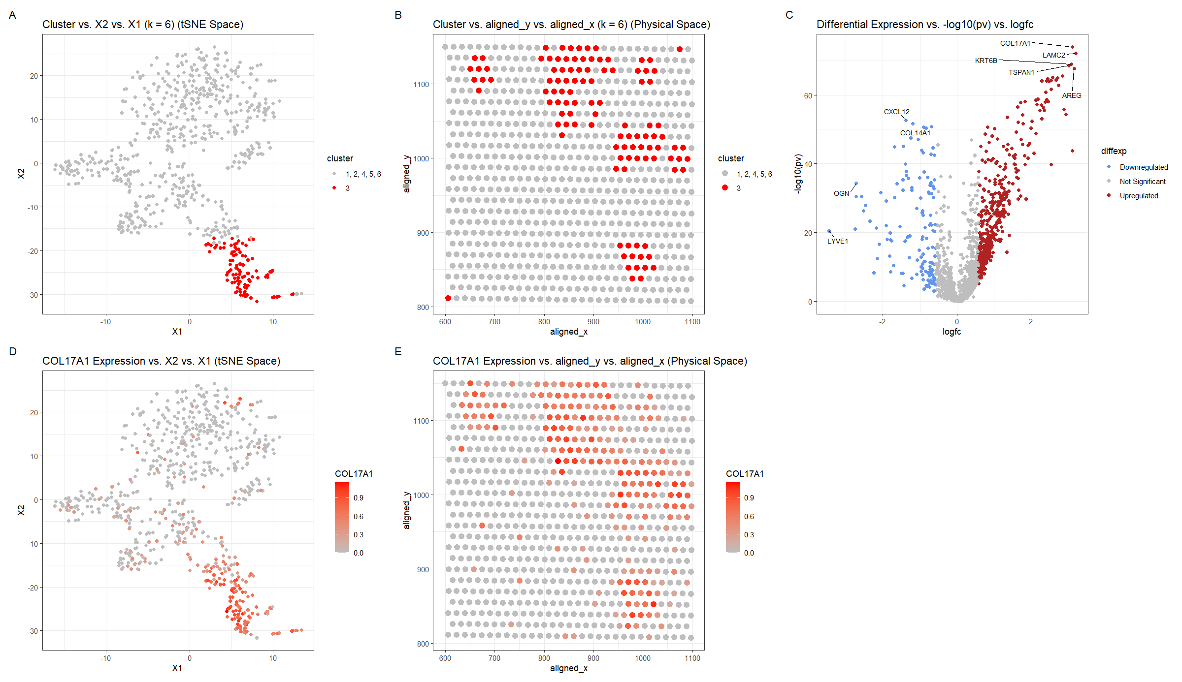
For plot A, I am visualizing the quantitative data of the X1 and X2 tSNE embedding values, and categorical data of the cluster the spot belongs to. I am using the geometric primitive of points to represent each spot on the spatial transcriptomics slide. To encode the X1 embedding value, I am using the visual channel of position along the x axis. To encode the X2 value, I am using the visual channel of position along the y axis. To encode the categorical cluster the spot belongs to, I am using the visual channel of saturation going from an unsaturated light grey to a saturated red.
For plot B, I am visualizing the spatial data of the aligned x and y positions for each spot, and categorical data of the cluster the spot belongs to. I am using the geometric primitive of points to represent each spot on the spatial transcriptomics slide. To encode the spatial aligned x position, I am using the visual channel of position along the x axis. To encode the spatial aligned y position, I am using the visual channel of position along the y axis. To encode the categorical cluster the spot belongs to, I am using the visual channel of saturation going from an unsaturated light grey to a saturated red.
For plot C, I am visualizing the quantitative data of the log-transformed p-value, the quantitative data of the log-transformed fold change, and the ordinal data for the differential expression level for each gene. I am using the geometric primitive of points to represent each gene. To encode the log-transformed fold change, I am using the visual channel of position along the x axis. To encode the log-transformed p-value, I am using the visual channel of position along the y axis. To encode the differential expression level, I am using visual channel of color hue with blue representing downregulated expression, red representing upregulated expression, and grey representing no significant differential expression for a given gene.
For plot D, I am visualizing the quantitative data of the X1 and X2 tSNE embedding values, and quantitative data of normalized log-scaled COL17A1 expression for each spot. I am using the geometric primitive of points to represent each spot on the spatial transcriptomics slide. To encode the X1 embedding value, I am using the visual channel of position along the x axis. To encode the X2 value, I am using the visual channel of position along the y axis. To encode the quantitative normalized log-scaled COL17A1 expression, I am using the visual channel of saturation going from an unsaturated light grey to a saturated red.
For plot E, I am visualizing the spatial data of the aligned x and y positions for each spot, and quantitative data of normalized log-scaled COL17A1 expression for each spot. I am using the geometric primitive of points to represent each spot on the spatial transcriptomics slide. To encode the spatial aligned x position, I am using the visual channel of position along the x axis. To encode the spatial aligned y position, I am using the visual channel of position along the y axis. To encode the quantitative normalized log-scaled COL17A1 expression, I am using the visual channel of saturation going from an unsaturated light grey to a saturated red.
Plots A, B, D, E are scatter plots. Plot C is a volcano plot.
The Gestalt principles of proximity and similarity are present because the more similar plots are adjacent. For example, A and B both involve the categorical cluster variable. A and D are both in tSNE space. B and E are both in physical space. D and E involve the quantitative COL17A1 expression variable. The Gestalt principle of continuity is used because progressing from plot A to plot E aligns with the steps used to identify cluster 3’s cell-type (described below).
Write a description to convince me that your cluster interpretation is correct. Your description may reference papers and content that allowed you to interpret your cell cluster as a particular cell-type.
To cluster the data, k-means clustering with k=6 was used. k=6 was found by constructing an elbow plot and picking the elbow. Cluster 3 was chosen because it appeared to be well-defined in tSNE space and separate from the other clusters (Figure A). The cluster was then also visualized in physical space for later comparison once a differentially upregulated gene is chosen (Figure B). For this, a two-sided Wilcox test was used comparing the gene expression levels for cluster 3 with those of the other clusters (1, 2, 4, 5, 6) for each gene. The p-values were -log10 transformed, so small p-values have map to high values, and the log2 fold change was computed. Using whether the log2 fold change was positive or negative, the direction of the differential expression, upregulated or downregulated respectively, could be ascertained. Points with p-values >= 0.01 and with absolute value of log2 fold change less than 0.58 (fold-change of 1.5) were considered insignificant (https://training.galaxyproject.org/training-material/topics/transcriptomics/tutorials/rna-seq-viz-with-volcanoplot-r/tutorial.html). Finally, outlier points with high -log10 p-values or extreme log2fc were labeled with the names of the genes. This was done in both the downregulated and upregulated regions. COL17A1 was chosen as a gene of interest and its expression was graphed in tSNE and physical space. Regions of high COL17A1 expression matched the cluster 3 regions, which makes sense because the k-means clustering algorithm would use COL17A1 as a major factor since it is differentially expressed.
Notably upregulated genes (COL17A1, LAMC2, KRT6B, TSPAN1, AREG), were searched for on Human Protein Atlas to identify the tissue cell-type the cluster corresponds to (https://www.proteinatlas.org). Given the hint that the tissue is breast cancer tissue, it was noted that COL17A1, LAMC2–the two genes with the largest -log10(pv) and log2fc–had high enrichment scores for breast myoepithelial cells 0.816 and 0.824 respectively. Enrichment score is the mean correlation between the gene and the 3 reference transcripts selected to represent each cell type profiled within the tissue. The enrichment scores for these genes for breast myoepithelial cells were greater than those for of any other breast tissue cell-type (glandular, glandular progenitors, adipocytes), which were < 0.65. A similar finding was there for KRT6B, where the enrichment score 0.569 was greater for breast myoepithelial cells than the other cell-types, but the enrichment score was not as strong as for the other 2 genes. This makes sense though, because KRT6B did not have as outlying of -log10(pv) and log2fc values in Figure C. TSPAN1 had a enrichment score of 0.530 which was greater than the enrichment score for glandular progenitors and adipocytes, but not glandular cells. AREG had 0 enrichment score for all breast cell-types except glandular cells at .345. Considering that the genes suggesting breast myoepithelial cells were more strongly upregulated in Figure C and had greater enrichment scores than the genes suggesting breast glandular cells, it makes sense to consider them as stronger indicators of the cell-type.
I confirmed this with research papers in the literature. COL17, which COL17A1 expresses, is “observed in stratified and pseudostratified epithelia such as skin and myoepithelial cells in the mammary gland” (https://www.ncbi.nlm.nih.gov/pmc/articles/PMC8297889/). It is associated with inhibition of breast cancer cell proliferation and growth. LAMC2 is also noted as being “specifically localized to epithelial cells in skin, lung and kidney”, so it could be found in breast skin (https://www.ncbi.nlm.nih.gov/gene/3918).
Thus, I have identified the cell-type of cluster 3 to be breast myoepithelial cells.
Please share the code you used to reproduce this data visualization.
data <-
    read.csv("genomic-data-visualization-2024/data/eevee.csv.gz",
             row.names = 1)

data[1:10, 1:10]
pos <- data[, 2:3]
gexp <- data[, 4:ncol(data)]

# from lesson 9
gexpfilter <- gexp[, colSums(gexp) > 1000]
gexpnorm <- log10(gexpfilter/rowSums(gexpfilter) * mean(rowSums(gexpfilter))+1)

# find k with elbow method
results <- sapply(seq(2, 20, by=1), function(i) {
    print(i)
    com <- kmeans(gexpnorm, centers=i)
    return(com$tot.withinss)
})
plot(results, type="l")

pcs <- prcomp(gexpnorm)
plot(pcs$sdev[1:100])

set.seed(42)
com <- as.factor(kmeans(gexpnorm, centers=6)$cluster)

library(Rtsne)
set.seed(42)
emb <- Rtsne(pcs$x)$Y


library(ggplot2)
df <- data.frame(emb, com)
ggplot(df) +
    geom_point(aes(x = X1, y = X2, col=com), size=1) +
    theme_bw()

df2 <- df
df2[com!=3, "com"] = 1
p1 <- ggplot(df2) +
    geom_point(aes(x = X1, y = X2, col=com)) +
    scale_color_manual(values = c("grey", "red"), labels = c("1, 2, 4, 5, 6", "3"))+
    labs(col='cluster') +
    labs(title = 'Cluster vs. X2 vs. X1 (k = 6) (tSNE Space)') +

    theme_bw()
p1

df3 <- data.frame(pos, df2)
p2 <- ggplot(df3) +
    geom_point(aes(x = aligned_x, y = aligned_y, col=com), size=3) +
    scale_color_manual(values = c("grey", "red"), labels = c("1, 2, 4, 5, 6", "3"))+
    labs(col='cluster') +
    labs(title = 'Cluster vs. aligned_y vs. aligned_x (k = 6) (Physical Space)') +

    theme_bw()
p2

pv <- sapply(colnames(gexpnorm), function(i) {
    print(i) ## print out gene name
    wilcox.test(gexpnorm[com == 3, i], gexpnorm[com != 3, i])$p.val
})
logfc <- sapply(colnames(gexpnorm), function(i) {
    print(i) ## print out gene name
    log2(mean(gexpnorm[com == 3, i])/mean(gexpnorm[com != 3, i]))
})

df4 <- data.frame(pv = pv, logpv=-log10(pv), logfc)
df4["gene"] <- rownames(df4)
df4["diffexp"] = "Not Significant"
df4[df4["pv"] < 0.01 & df4["logfc"] > 0.58, "diffexp"] = "Upregulated"
df4[df4["pv"] < 0.01 & df4["logfc"] < -0.58, "diffexp"] = "Downregulated"
df4$diffexp = as.factor(df4$diffexp)

levels(df4$diffexp)

library(ggrepel)

# https://ggrepel.slowkow.com/articles/examples.html#examples
p3 <- ggplot(df4) + geom_point(aes(x = logfc, y = -log10(pv), color=diffexp)) +
    geom_text_repel(aes(label=ifelse(logpv > 67 | (logpv > 50 & logfc < -1) | logfc < -3 | (logpv > 32 & logfc < -2),as.character(gene), "")
                        , x = logfc, y = logpv), size=3, max.overlaps = Inf, box.padding = .5) +
    scale_color_manual(values = c("cornflowerblue", "grey", "firebrick")) +
    labs(title = 'Differential Expression vs. -log10(pv) vs. logfc') +
    theme_bw()
p3

df5 <- data.frame(pos, gexpnorm, emb, com)
p4 <- ggplot(df5) +
    geom_point(aes(x = X1, y = X2, col=COL17A1)) +
    labs(title = 'COL17A1 Expression vs. X2 vs. X1 (tSNE Space)') +
    scale_color_gradient(low="grey", high="red")+
    theme_bw()
p4

p5 <- ggplot(df5) +
    geom_point(aes(x = aligned_x, y = aligned_y, col=COL17A1), size=3) +
    labs(title = 'COL17A1 Expression vs. aligned_y vs. aligned_x (Physical Space)') +
    scale_color_gradient(low="grey", high="red")+
    theme_bw()
p5

library(patchwork)

p1 + p2 + p3 + p4 + p5 +
    plot_annotation(tag_levels = 'A') + plot_layout(nrow = 2, ncol = 3)