Spatially Resolved Gene Expression Analysis using KMeans clustering

Describe your figure briefly so we know what you are depicting (you no longer need to use precise data visualization terms as you have been doing). Write a description to convince me that your cluster interpretation is correct. Your description may reference papers and content that allowed you to interpret your cell cluster as a particular cell-type. You must provide attribution to external resources referenced. Links are fine; formatted references are not required.
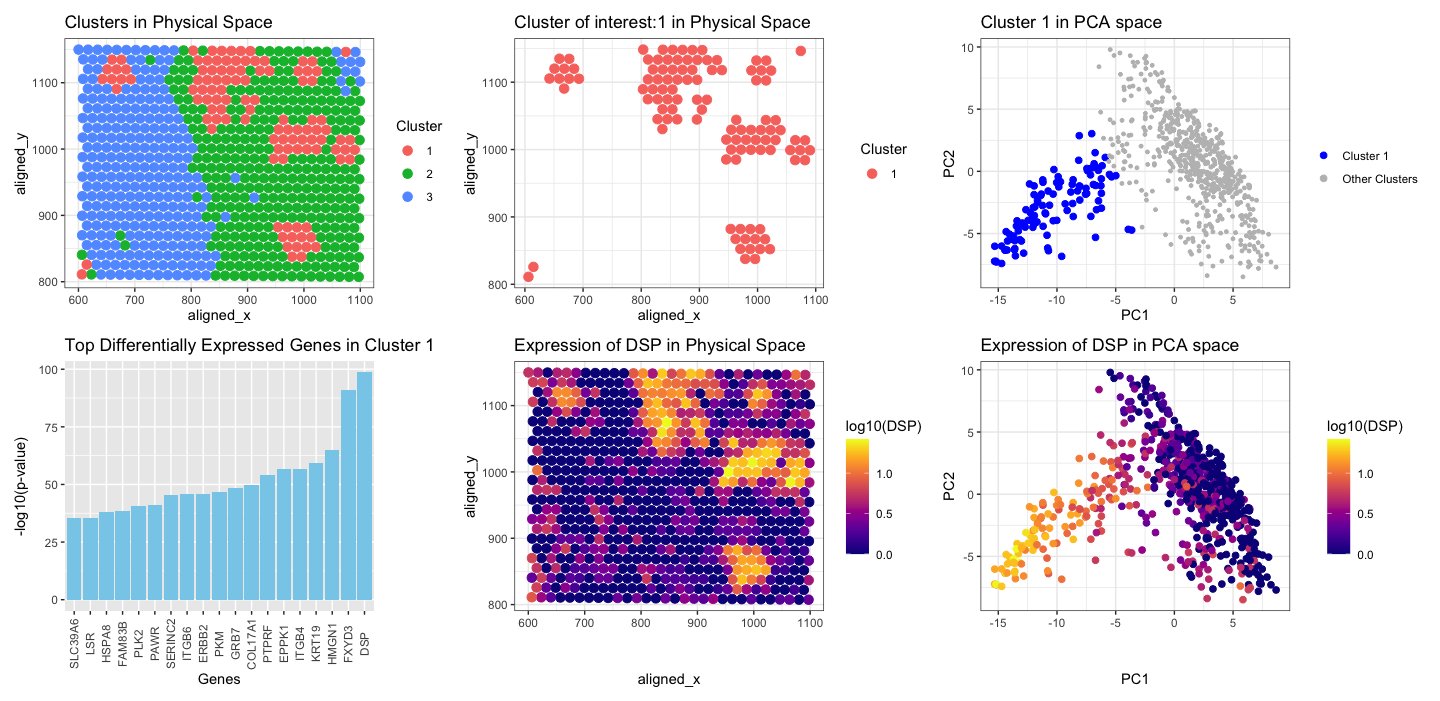
Firstly I applied KMeans clustering on the normalized gene expression data, with random K=3. Then, I chose a cluster which was scattered at few spots in spatial position (blue in color), not together like cluster 1 and 2. I was interested to see which gene is highly expressed in this cluster. I performed t-test to see the upregulated genes in this cluster of interest. I found that DSP (pvalue 2.519682e-99) was the top gene that was upregulated. Further, I visualized DSP in the physical space and in PCA space.
- Spatial Distribution of Clusters: The first panel shows the spatial distribution of spots with multiple cell-types within the tissue. Each spot is represented by a point on the plot, with colors hue indicating the clusters assigned by KMeans clustering. Notably, cluster 1 (shown in red) appears scattered across the tissue, contrasting with the more cohesive distributions of clusters two and three.
- Spatial Distribution of Cluster of interest: The second panel shows the spatial distribution of the spots with multiple cell-types for cluster 1.
- Cluster of interest in PCA space: The spots belonging to cluster 1, are all grouped together in the reduced dimensionality space (blue), along negative PC1, and PC2.
- Differentially expressed genes in cluster 1: I used t-test to find the statistically significant upregulated genes in cluster 1. The plot shows negative log10 pvalue plot for top 20 genes, DSP is the top gene with highest pvalue.
- Gene Expression in Physical Space: The expression pattern of the gene DSP across the spatial coordinates shows cells corresponding to cluster 1, which were identified as scattered in spatial position (red in first/second plot), exhibit high expression of DSP (yellow) at the same spatial location based on x,y coordinates.
- Gene Expression in PCA Space: The last panel illustrates the expression pattern of DSP projected onto a reduced-dimensional space obtained through PCA. Spots with high expression of DSP group together in the PCA space, and are in the similar position in PCA space as the position of cluster 1 in PCA (blue in plot 3). The yellow spots are clustered together on the negative PC1, and PC2 axis. This clustering pattern implies that the yellow spots are likely to represent a subpopulation of cells that exhibit high DSP expression, possibly associated with a particular cell type or functional state.
By integrating spatial information with gene expression analysis, I inferred that cluster 1 likely represents spots containing multiple cell types characterized by high expression of the DSP gene. The known biology of DSP, or desmoplakin, indicates its involvement in cell-cell adhesion, particularly within desmosomes, structures found in tissues subjected to mechanical stress, such as the skin and heart [1][2]. Hence, I speculate that the cell types within cluster 1 may correspond to cell type like- epithelial cells in the skin, and cardiac muscle cells (e.g., cardiomyocytes).
[1] Green KJ, Simpson CL. Desmosomes: new perspectives on a classic. J Invest Dermatol. 2007;127(11):2499-2515. <doi:10.1038/sj.jid.5700915>
[2] McGrath, J. A., & Mellerio, J. E. (2010). Ectodermal dysplasia-skin fragility syndrome. Dermatologic clinics, 28(1), 125–129. https://doi.org/10.1016/j.det.2009.10.014
You must include the entire code you used to generate the figure so that it can be reproduced.
library(viridis)
library(patchwork)
library(ggplot2)
data <- read.csv('/Users/nidhisoley/Desktop/GDataViz/eevee.csv.gz', row.names=1)
pos <- data[, c("aligned_x", "aligned_y")]
gexp <- data[, 4:ncol(data)]
gexpnorm <- log10(gexp/rowSums(gexp) * mean(rowSums(gexp)) + 1)
pcs <- prcomp(gexpnorm)
#K-means
clusters <- as.factor(kmeans(gexpnorm, centers = 3)$cluster)
p1 <- ggplot(data.frame(pos, Cluster = clusters)) +
  geom_point(aes(x = aligned_x, y = aligned_y, col = Cluster), size = 3) +
  theme_bw() +
  labs(title = "Clusters in Physical Space")
#cluster of interest
cluster_of_interest <- 1
df <- data.frame(data, kmeans=(clusters))
df1 <- df[df$kmeans == cluster_of_interest,]
p2 <-ggplot(df1) + geom_point(aes(x = aligned_x, y=aligned_y, col=kmeans),
                              size=3) + theme_bw() +
  labs(title='Cluster of interest:1 in Physical Space')+
  labs(color='Cluster')
#pca
pca_df <- data.frame(PC1 = pcs$x[, 1], PC2 = pcs$x[, 2], Cluster = clusters)
cluster_1_df <- pca_df[pca_df$Cluster == cluster_of_interest, ]
p3 <- ggplot(pca_df, aes(x = PC1, y = PC2)) +
  geom_point(data = cluster_1_df, aes(col = "Cluster 1"), size = 2) +
  geom_point(data = pca_df[pca_df$Cluster != cluster_of_interest, ], aes(col = "Other Clusters"), size = 1) +
  scale_color_manual(values = c("Cluster 1" = "blue", "Other Clusters" = "gray")) +
  theme_bw() +
  labs(title = "Cluster 1 in PCA space",
       color = "Cluster") +
  guides(color = guide_legend(title = NULL))
#t-test
cluster_1_genes <- colnames(gexpnorm)[clusters == cluster_of_interest]
results <- sapply(cluster_1_genes, function(g) {
  t.test(gexpnorm[clusters == cluster_of_interest, g],
         gexpnorm[clusters != cluster_of_interest, g],
         alternative = 'greater')$p.val
})
significant_genes <- names((sort(results[results < 0.05])[1:19]))
significant_genes_df <- data.frame(Gene = significant_genes, p_value = results[significant_genes])
significant_genes_df$log_p_value <- -log10(significant_genes_df$p_value)
p4 <- ggplot(significant_genes_df, aes(x = reorder(Gene, log_p_value), y = log_p_value)) +
  geom_bar(stat = "identity", fill = "skyblue") +
  theme(axis.text.x = element_text(angle = 90, vjust = 0.5, hjust = 0.5)) +
  labs(title = "Top Differentially Expressed Genes in Cluster 1",
       x = "Genes",
       y = "-log10(p-value)")
#DSP
gene_of_interest <- 'DSP'
p5 <- ggplot(data.frame(pos, gene = gexpnorm[, gene_of_interest])) +
  geom_point(aes(x = aligned_x, y = aligned_y, col = gene), size = 3) +
  scale_color_viridis(option = 'plasma')+
  theme_bw() +
  labs(title = paste("Expression of", gene_of_interest, "in Physical Space"))+
  labs(color='log10(DSP)')
p6 <- ggplot(data.frame(pcs$x, gene = gexpnorm[, gene_of_interest])) +
  geom_point(aes(x = PC1, y = PC2, col = gene), size = 2) +
  scale_color_viridis(option = 'plasma')+
  theme_bw() +
  labs(title = paste("Expression of", gene_of_interest, "in PCA space"))+
  labs(color='log10(DSP)')
p1 +p2+p3+p4+p5+p6
plot_layout(ncol = 3)