The Effects of Normalization & Transformation on Loading Values for PCA

What data types are you visualizing?
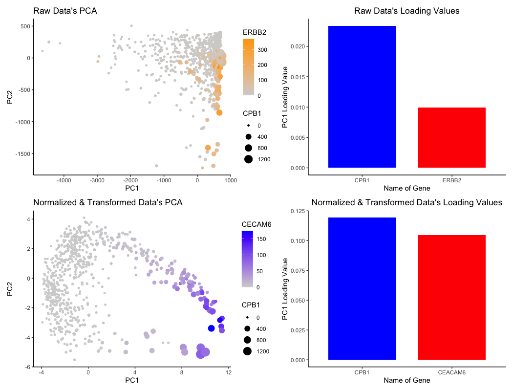
For the graph titled “Raw Data’s PCA”, I am visualizing the (1) quantitative data of ERBB2 expression, (2) quantitative data of CPB1 expression, (3) quantitative data of each cell’s projection in the linear dimension reduction based on principle component 1 (PC1) and principle component 2 (PC2) axes.
For the graph titled “Raw Data’s Loading Values”, I am visualizing the (1) quantitative data of PC1 loading values for two genes and (2) categorical data of the two genes CPB1 and ERBB2.
For the graph titled “Normalized & Transformed Data’s PCA”, I am visualizing the (1) quantitative data of CECAM6 expression, (2) quantitative data of CPB1 expression, (3) quantitative data of each cell’s projection in the linear dimension reduction based on principle component 1 (PC1) and principle component 2 (PC2) axes.
For the graph titled “Normalized & Transformed Data’s Loading Values”, I am visualizing the (1) quantitative data of PC1 loading values for two genes and (2) categorical data of the two genes CECAM6 and CPB1.
What data encodings (geometric primitives and visual channels) are you using to visualize these data types?
For the PCA visualizations, cells are represented by the geometric primitive of points. The quantitative data of each cell’s projection alongside the PC1 axis is represented by the x-position, while the projection alongside the PC2 axis is represented by the y-position. The visual channel of saturation is utilized to encode the expression of ERBB2 (top PCA plot) and CECAM6 (bottom plot), with higher expression linked to higher saturation and lower expression linked to lower saturation. The visual channel of size is utilized to encode the expression of CPB1 for both PCA plots, with higher expression of CPB1 corresponding to larger points and lower expression corresponding to smaller points.
For the bar plots graphing the loading values, the PC1 loading values for each specific gene is represented by the geometric primitive of lines and area. The categorical data of “gene name” is encoded by the visual channel of hue, with a distinct color distinguishing between the two genes that are also encoded for in the PCA visualizations. The actual loading values are encoded by the visual channel of area, with higher loading values covering more area / size.
What about the data are you trying to make salient through this data visualization?
I am trying to make salient the effects of “what happens if I do or not not normalize and/or transform the gene expression data (e.g. log and/or scale) prior to dimensionality reduction”. Notably, the bar plots capture the top two genes with highest loading values for PC1. With this in mind, we can see in how after normalization and transformation of the data, while CPB1 is involved in both cases, CECAM6 actually becomes more dominant in the normalized and transformed data. Also, the loading values themselves actually increase in magnitude.
What Gestalt principles or knowledge about perceptiveness of visual encodings are you using to accomplish this?
I am utilizing the Gestalt’s principle of similarity within the PCA plots, as points that are either (1) of similar colorr or (2) of similar size are considered to be of the same group. I also utilized Gestalt’s principle of proximity in grouping the graphs related together horizontally: the raw data graphs are on the top half, while the normalized and transformed data graphs are on the bottom half. For visualizing the quantitative data, I followed the rankings of best encodings covered in class to utilize saturation and size.
library(ggplot2)
data <- read.csv('eevee.csv.gz', row.names = 1)

dim(data)
data[1:10, 1:10]
colnames(data)

## Initialization of variables
x_pos <- data[,2]
y_pos <- data[,3]
gen_exp <- data[,4:ncol(data)]
genes <- colnames(gen_exp)

## Filter out data to reduce stack overflow issue with tSNE
topgene <- sort(apply(gen_exp, 2, var), decreasing=TRUE)[1:1000]
topgene <- names(topgene)
gen_expFilter <- gen_exp[,topgene]

## Going to compare the effects of not normalizing v.s.
## normalizing the data

## Normalize the data
tot_gen_exp <- rowSums(gen_expFilter)
norm_gen_exp <- gen_expFilter/tot_gen_exp * median(tot_gen_exp)
log_norm_gen_exp <- log10(norm_gen_exp + 1)

## PCA Analysis
pcs_norm <- prcomp(log_norm_gen_exp) ## normalized and scaled
pcs <- prcomp(gen_expFilter) ## not normalized and not scaled

## genes with high loadings on PC1 for not normalized and not scaled data
head(sort(pcs$rotation[,1], decreasing = TRUE)) # for PC1

## genes with high loadings on PC1 for normalized and scaled data
head(sort(pcs_norm$rotation[,1], decreasing = TRUE)) # for PC1

## look at loading values for normalized & log scaled data
loading_pcs_norm <- data.frame(PC1 = pcs_norm$rotation[,1])
df_loading_norm <- data.frame(gene_names = c('CPB1', 'CEACAM6'),
  loading = c(loading_pcs_norm['CPB1',], loading_pcs_norm['CEACAM6',])
)

loading_pcs_norm_graph <- ggplot(data = df_loading_norm, aes(x = factor(gene_names, levels = rev(levels(factor(gene_names)))), y = loading, fill = gene_names)) +
  geom_col(width = 0.75) +
  scale_fill_manual(values = c('red', 'blue')) +
  xlab('Name of Gene') +
  ylab('PC1 Loading Value') +
  theme_classic() +
  theme(legend.position = 'none') +
  ggtitle("Normalized & Transformed Data's Loading Values") +
  theme(plot.title = element_text(hjust = 0.5))

## look at loading values for raw data
loading_pcs <- data.frame(PC1 = pcs$rotation[,1])
df_loading <- data.frame(gene_names = c('CPB1', 'ERBB2'),
  loading = c(loading_pcs['CPB1',], loading_pcs['ERBB2',])
)

loading_pcs_graph <- ggplot(data = df_loading, aes(x = gene_names, y = loading, fill = gene_names)) +
  geom_col(width = 0.75) +
  scale_fill_manual(values = c('blue', 'red')) +
  xlab('Name of Gene') +
  ylab('PC1 Loading Value') +
  theme_classic() +
  theme(legend.position = 'none') +
  ggtitle("Raw Data's Loading Values") +
  theme(plot.title = element_text(hjust = 0.5))

## Prepare dataframes for graphing
df_norm <- data.frame(pcs_norm$x[,1:2], ceacam6 = data[, "CEACAM6"], cpb1 = data[, "CPB1"])
norm_plot <- ggplot(df_norm, aes(x = PC1, y = PC2, color = ceacam6, size = cpb1)) +
  geom_point() +
  scale_color_gradient(low = "lightgrey", high = "blue") +
  labs(x = "PC1", y = "PC2", size = "CPB1", color = "CECAM6") +
  ggtitle("Normalized & Transformed Data's PCA") +
  theme(plot.title = element_text(hjust = 0.5)) +
  theme_classic()

df <- data.frame(pcs$x[,1:2], cpb1 = data[, "CPB1"], erbb2 = data[, "ERBB2"])
plot <- ggplot(df, aes(x = PC1, y = PC2, color = erbb2, size = cpb1)) +
  geom_point() +
  scale_color_gradient(low = "lightgrey", high = "orange") +
  labs(x = "PC1", y = "PC2", size = "CPB1", color = "ERBB2") +
  ggtitle("Raw Data's PCA") +
  theme(plot.title = element_text(hjust = 0.5)) +
  theme_classic()

plot + loading_pcs_graph + norm_plot + loading_pcs_norm_graph