Comparing the effect of tSNE on varying number of PCs:KRT7 expression

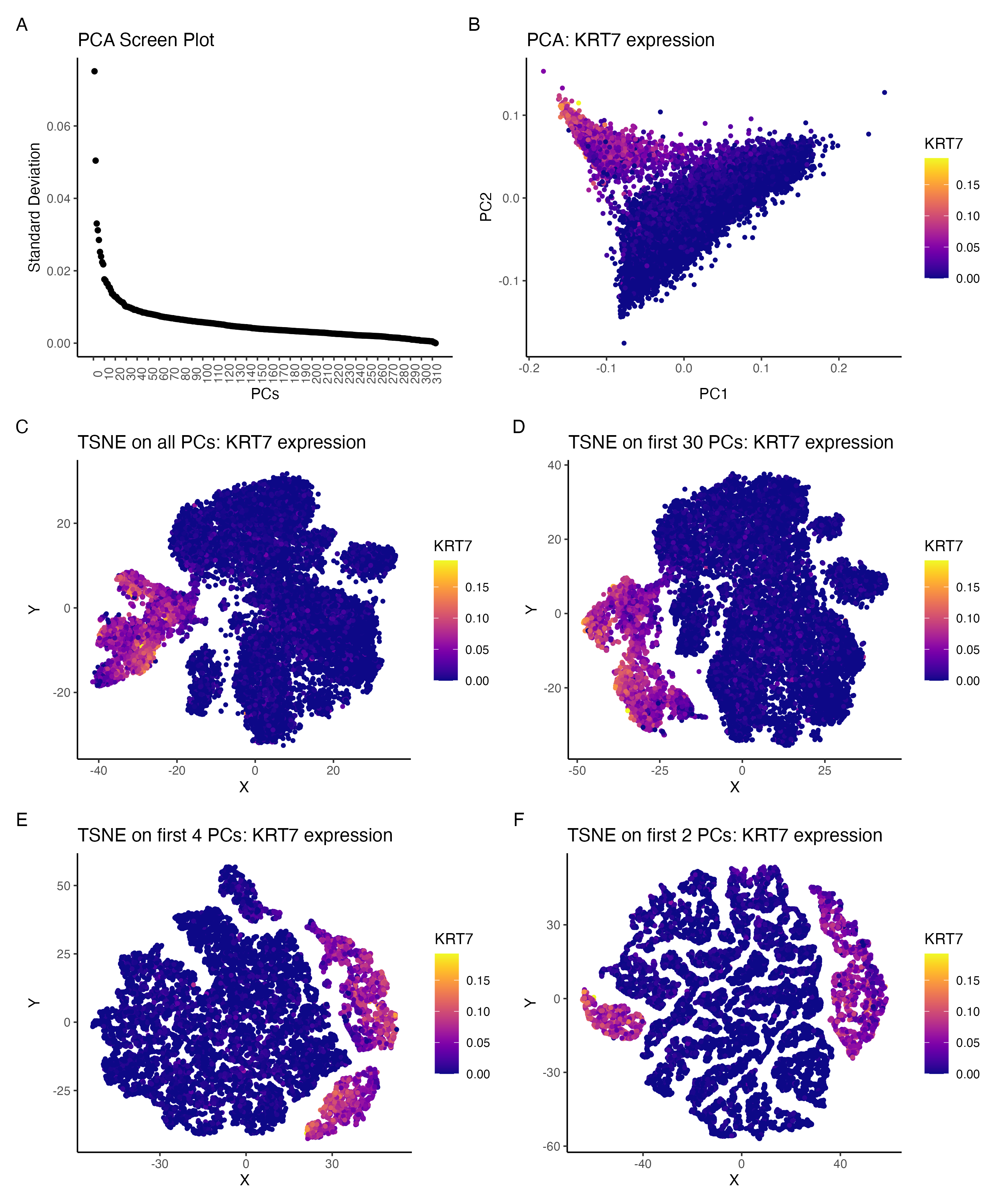
I am visualizing the effect of performing non-linear dimensionality reduction (TSNE) on varying number of PCs. The gene expression was normalized (by total gene expression for each cell) prior to PCA. t-SNE was then performed by using all PCs, first 30 PCs only, first 4 PCs only and first 2PCs only.
What data types are you visualizing?
Panel A visualizes standard deviation (quantitative) and it’s value for each PC (ordinal data).
Panel B visualizes the location of each cell (spatial ) in the reduced feature space from PCA (PC1 v PC2) as well as the variation
in the normalized expression KRT7 gene (quantitative).
Panels C-F visualize the location of each cell on the reduced feature space from tSNE (embedding 1 v embedding 2) as well as the
variation in the normalized expression of KRT7 gene (quantitative)
What data encodings (geometric primitives and visual channels) are you using to visualize these data types?
Panel A: The geometric primitive used is points (for standard deviation) and the visual channel used is the position on the y-axis for standard deviation and position on x-axis for PC index. Panels B-F: The geometric primitive used is points (for the spatial location of each cell after PCA or tSNE) and the visual channel used is color (hue) to indicate the normalized expression of KRT7 gene
What about the data are you trying to make salient through this data visualization?
Through this visualization I am trying to emphasize the effect of performing tSNE on varying number of PCs. The PCA screen plot in panel A represents the variance in the data, captured by each of the PCs. The visualizations in panels B shows the expression of KRT7 gene in the PC space.
Panels C-F show the expression of KRT7 when tSNE is performed on all PCs, first 30 PCs only, first 4 PCs only and first 2 PCs only respectively. It can be seen that panels C and D are comparable and hence running tSNE only on first 30 PCs and panels E and F are more similar to each other.
What Gestalt principles or knowledge about perceptiveness of visual encodings are you using to accomplish this?
The Gestalt principle of similarity is used to visualize cells that express a similar proportion of genes and principle of proximity is used as similar cells are located closer together in the reduced feature space.
library(dplyr)
library(tidyverse)
library(ggplot2)
library(Rtsne)
library(patchwork)
library(viridis)

## Data Description
# Each row is a cell ~17000
# Columns are mainly genes ~300

# Set working directory path and read in data
setwd("/Users/archanabalan/Karchin Lab Dropbox/Archana Balan/Coursework/Spring2024/GDV/homework/")
data = read.csv("./data/pikachu.csv.gz", row.names =1)

# Drop first 5 columns for gene expression (cell_id, cell_area etc)
gexp = data[, -c(1:5)]
rownames(gexp) <- data$cell_id

# normalize data by total gene expression for each cell
gexpnorm = gexp/rowSums(gexp)
# check if normalization is correct (value would be 1 for all cells)
unique(rowSums(gexpnorm) )


# PCA using prcomp function
# Center = TRUE and scale = FALSE params
pcs = prcomp(gexpnorm, center = TRUE, scale. = FALSE)


# screen plot
sd.df = data.frame(sd = pcs$sdev) %>% mutate(x = 1:nrow(.))

# Ref: https://stackoverflow.com/questions/11775692/how-to-specify-the-actual-x-axis-values-to-plot-as-x-axis-ticks-in-r
p1 = ggplot(data = sd.df, aes (x=x, y = sd)) +
        geom_point() +
        theme_classic() +
        theme(axis.text.x = element_text(angle=90)) +
        scale_x_continuous(breaks = seq(0,315,by=10 ))+
        labs(x = "PCs", y = "Standard Deviation") +
        ggtitle("PCA Screen Plot")


## Explore PC loadings

# Positive loadings on PC1
pc1_pos_genes = head(sort(pcs$rotation[,1], decreasing=TRUE))
# Negative loadings on PC1
pc1_neg_genes = head(sort(pcs$rotation[,1]))

# Positive loadings on PC2
pc2_pos_genes = head(sort(pcs$rotation[,2], decreasing=TRUE))
# Negative loadings on PC2
pc2_neg_genes = head(sort(pcs$rotation[,2], decreasing=FALSE))


## KRT7 have high negative loadings on pC1 and high positive loadings on PC2
## Using this gene for further exploration

pc.df = as.data.frame(pcs$x) %>%
            mutate( KRT7 = gexpnorm$KRT7)

# Plot KRT7 expression on PC1 vs PC2
# Ref: https://sjmgarnier.github.io/viridis/reference/scale_viridis.html
p2 = ggplot(data = pc.df)  +
       geom_point(size = 1,  aes (x=PC1, y = PC2, col = KRT7)) +
       theme_classic() +
       scale_color_viridis(option="plasma") +
       labs(x = "PC1", y = "PC2") +
        ggtitle("PCA: KRT7 expression")

# TSNE on all PCs
tsne_all = Rtsne(pcs$x, dims =2, pca = FALSE)

plot.df_all = data.frame(x = tsne_all$Y[,1],
                     y = tsne_all$Y[, 2],
                     KRT7 = gexpnorm$KRT7)

# tSNE plot for all PCs
p3 = ggplot(data = plot.df_all)  +
        geom_point(size = 1,  aes (x=x, y = y, col = KRT7)) +
        theme_classic() +
        scale_color_viridis(option="plasma") +
        labs(x = "X", y = "Y") +
        ggtitle("TSNE on all PCs: KRT7 expression")

# tsne on first 30 PCs
tsne_30 = Rtsne(pcs$x[, 1:30], dims =2, pca = FALSE)


plot.df_30 = data.frame(x = tsne_30$Y[,1],
                     y = tsne_30$Y[, 2],
                     KRT7 = gexpnorm$KRT7)

# tSNE plot for first 30 PCs
p4 = ggplot(data = plot.df_30)  +
  geom_point(size = 1,  aes (x=x, y = y, col = KRT7)) +
  theme_classic() +
  scale_color_viridis(option="plasma") +
  labs(x = "X", y = "Y") +
  ggtitle("TSNE on first 30 PCs: KRT7 expression")

# tsne on first 4 PCs
tsne_4 = Rtsne(pcs$x[, 1:4], dims =2, pca = FALSE)

plot.df_4 = data.frame(x = tsne_4$Y[,1],
                     y = tsne_4$Y[, 2],
                     KRT7 = gexpnorm$KRT7)

# tSNE plot for first 4 PCs
p5 = ggplot(data = plot.df_4)  +
  geom_point(size = 1,  aes (x=x, y = y, col = KRT7)) +
  theme_classic() +
  scale_color_viridis(option="plasma") +
  labs(x = "X", y = "Y") +
  ggtitle("TSNE on first 4 PCs: KRT7 expression")


# tsne on first 2 PCs
tsne_2 = Rtsne(pcs$x[, 1:2], dims =2, pca = FALSE)

plot.df_2 = data.frame(x = tsne_2$Y[,1],
                       y = tsne_2$Y[, 2],
                       KRT7 = gexpnorm$KRT7)

# tSNE plot for first 2 PCs
p6 = ggplot(data = plot.df_2)  +
  geom_point(size = 1,  aes (x=x, y = y, col = KRT7)) +
  theme_classic() +
  scale_color_viridis(option="plasma") +
  labs(x = "X", y = "Y") +
  ggtitle("TSNE on first 2 PCs: KRT7 expression")


# using patchwork to create a multipanel figure
hw3.plt =  (p1 + p2 )/ (p3 + p4 ) / (p5 + p6)

# Ref: https://patchwork.data-imaginist.com/articles/guides/annotation.html
hw3.plt = hw3.plt + plot_annotation(tag_levels = 'A')
ggsave( "./hw3/hw3_abalan2.png",hw3.plt, width = 10, height = 12)