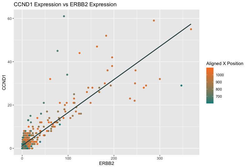
The relationship between CCND1 Expression and ERBB2 Expression

Whose code are you applying? Provide a JHED
I am applying Shaili Tripathi’s (jhed: stripat9) code to eevee dataset.
Critique the resulting visualization when applied to your data.
The data visualization has the geometric primitive of points to represent each cell and a line to represent the correlation between the ERBB2 and CCND1 gene expression. The regression line uses the visual channel of angle to reveal the linear relationship between the two genes.
The visual channels also include x-axis position representing ERBB2 expression and y-axis position representing CCND1 expression. In Shaili’s visualization, she uses visual channel of color to encode cell area, which is not a variable in the eevee dataset. Alternatively, I use visual channel of color to encode the aligned x-coordinate position, providing a third dimension of information that indicates where each expression measurement comes from spatially within the tissue. A color gradient from teal to orange represents the range of aligned x positions, with cooler colors presumably representing lower x positions and warmer colors indicating higher x positions.
Do you think the author was effective in making salient the point they said they wanted to make?
I think the author was effective in making salient the point she wanted to make. She intended to compare the expression levels of two genes, CCND1 and ERBB2, across cells. Points are plotted with their ERBB2 expression level on the x-axis and their CCND1 expression level on the y-axis, suggesting that the plot is analyzing a potential relationship or correlation between the expressions of these two genes. The plot also shows that more cells with smaller areas express both genes than those with larger areas.
One common pattern observed from Shaili’s and my visualization is the clustering of points in the lower left area, which typically indicates that there are many observations with relatively low expression levels for both ERBB2 and CCND1 genes
How could you improve the data visualization in making salient the point they said they wanted to make?
One thing can improve is to highlight specific ranges of the data. If there are particular ranges of gene expression that are of interest, we could highlight these using different colors or shapes. For instance, if high expression is of particular interest, we could use a color scale that becomes more intense with higher expression levels.
In addition, we can add the confidence interval around the regression line to provide context for the strength of the correlation.