Applying the Spatial Distribution of Gene Expression visualization to the CXCR4 gene

Whose code are you applying? Provide a JHED.
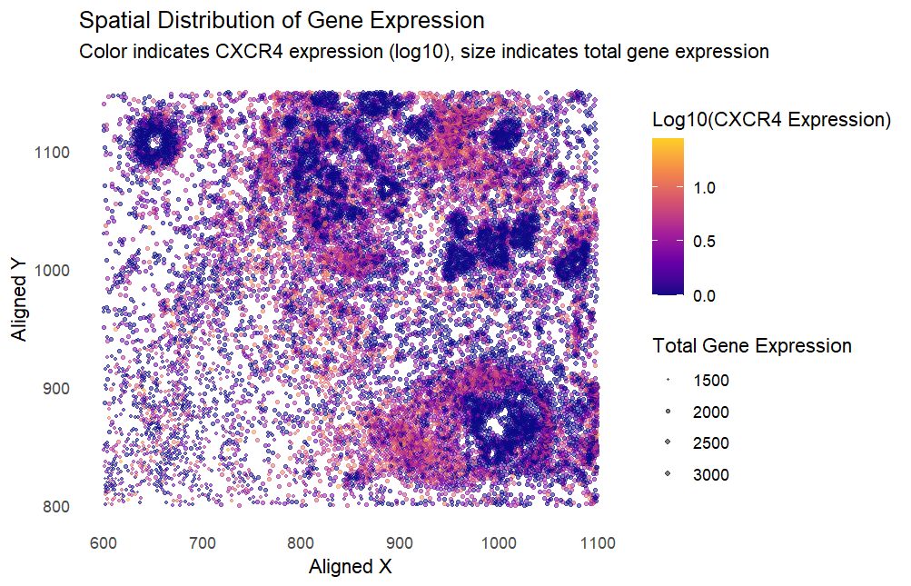
I am applying the code by Kiki Zhang (szhan128) for the eevee dataset to my pikachu dataset. There are two changes that I made to the code before applying it to my dataset. Firstly, the selected gene in the original code, TP53, is not present in my dataset, so I replaced it with the visualization of the CXCR4 gene from the pikachu dataset instead. Secondly, the size of the points in the visualization were too big for my dataset, due to the greater density of points in the pikachu dataset compared to the eevee dataset. This resulted in large overlaps between the points, hence I scaled the size of the points down by a factor of 1/5 to fit my dataset better.
Critique the resulting visualization when applied to your data. Do you think the author was effective in making salient the point they said they wanted to make? How could you improve the data visualization in making salient the point they said they wanted to make? If you don’t think the data visualization can be improved, explain why the data visualization is already effective.
The resulting visualization presents various types of data: the spatial location of each cell as (x,y) coordinates, as well as the quantitative data of total gene expression and log(CXCR4 expression). Applied to my dataset, the visualization was not salient because there is a high density of points with low CXCR4 expression. As such, the reader’s attention is first drawn towards dark-colored clumps of cells that do not express CXCR4, instead of the cells with high CXCR4 expression that are lighter in color and more sparsely populated. This makes it difficult to infer the relationship that higher CXCR4 expression has with total gene expression and the spatial location of the cells. To improve the visualization, I would choose to invert the color gradient so that cells with high CXCR4 expression are darker-coloured against the white background, creating more visual contrast so that cells with high CXCR4 expression stand out more to the reader. I would also log the values of the total gene expression, as the linear scale currently used makes it difficult to notice smaller points. By using log(total gene expression) we can better visualize all points and improve saliency for CXCR4 expression in cells with lower total gene expression.
data <- read.csv('pikachu.csv.gz', row.names = 1)
colnames(data)
# total expression levels at each spot
data$total_expression <- rowSums(data[, -(1:3)])
# log10 normalization of CXCR4 gene expression
data$CXCR4_log10 <- log10(data$CXCR4 + 1) # Add a pseudo-count to avoid log10 of zero
# plot the data
ggplot(data) +
  geom_point(aes(x = aligned_x, y = aligned_y,
                 col = CXCR4_log10,
                 size = total_expression),
             alpha = 0.5) +
  scale_color_viridis_c(option = "C", end = 0.9,
                        name = "Log10(CXCR4 Expression)") +
  scale_size_continuous(name = "Total Gene Expression",
                        range = c(1/5,6/5)) +
  labs(
    title = "Spatial Distribution of Gene Expression",
    subtitle = "Color indicates CXCR4 expression (log10), size indicates total gene expression",
    x = "Aligned X",
    y = "Aligned Y"
  ) +
  theme_minimal()+
  theme(
    panel.grid.major = element_blank(),
    panel.grid.minor = element_blank())