CCND1 Expression vs ERBB2 Expression

What data types are you visualizing?
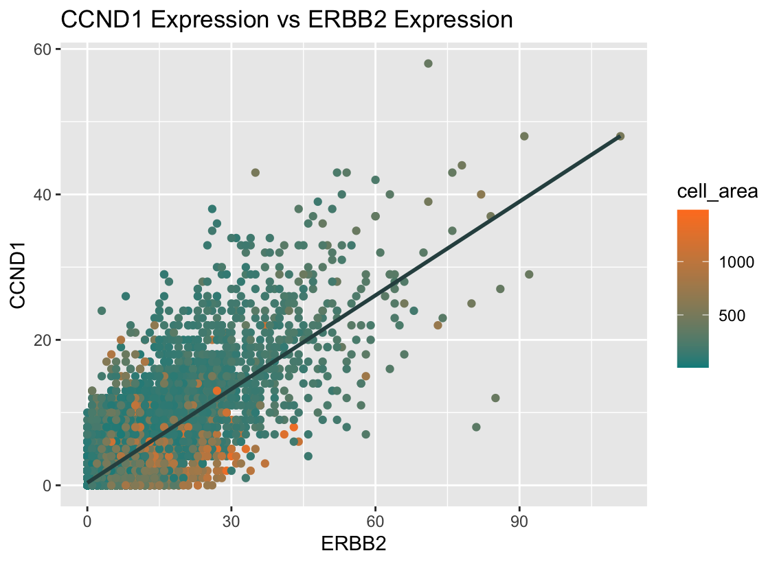
I am visualizing quantitative data for the expression counts of ERBB2 and CCND1, as well as the quantitative data for the cell area of each cell.
What data encodings are you using to visualize these data types?
I am using the geometric primitive of points to represent each cell and the visual channel of color to represent each cell’s area. I am also using the visual channels of position along the x-axis to represent ERBB2 expression and position along the y-axis to represent CCND1 expression. Additionally, I’m using the geometric primitive of line to represent the correlation between the ERBB2 and CCND1 expression, and this line uses the visual channel of angle to represent the linear and direct relationship between the two genes.
What type of data visualization is this? What about the data are you trying to make salient through this data visualization? What Gestalt principles have you applied towards achieving this goal if any?
Through my data visualization, I’m trying to make the direct relationship between the genes ERBB2 and CCND1 clear; it can be observed through the data that cells with more of one gene tend to have more of the other too. It can also be seen that cell’s with larger areas express both these genes less than those with smaller areas.
The gestalt principle of similarity states that elements that look similar are perceived to be of the same group, so I intentionally picked opposite colors: green and orange, to emphasize the range in cell area; because the colors are so different, it makes it easier for viewers to recognize that larger cells (those with greater areas) express ERBB2 and CCND1 less by grouping all orange cells together and all green cells together. I also utilized the gestalt principle of continuity, which groups elements arranged on a line as related, as the regression line visually follows the general direction of the points and creates a sense of continuity in the data. This helps viewers perceive the linear pattern and interpret my data visualization more easily.
Please share the code you used to reproduce this data visualization.
library(ggplot2)

data <- read.csv('pikachu.csv.gz', row.names = 1) # ~300 genes and ~17,000 cells

ggplot(data, aes(x = ERBB2, y = CCND1, color = cell_area)) +
  scale_colour_gradient(low = 'cyan4', high='chocolate1') +
  geom_point() +
  geom_smooth(method=lm , color="darkslategray", se=FALSE) +
  ggtitle("CCND1 Expression vs ERBB2 Expression")

# Referenced R Graph Gallery for line:
# https://r-graph-gallery.com/50-51-52-scatter-plot-with-ggplot2.html