Spatial Distribution of Gene Expression

What data types are you visualizing?
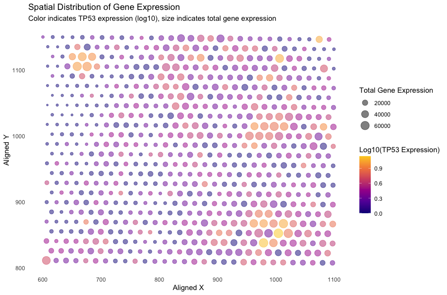
I am visualizing quantitative data of the log-10-transformed expression level of the TP53 gene, quantitative data of the total gene expression at each spot, and spatial data of aligned x and y coordinates according to the barcode.
What data encodings (geometric primitives and visual channels) are you using to visualize these data types?
I am using the geometric primitive of points to represent each aligned position with both x and y coordinates. To encode expression level of the TP53 gene, I am using the visual channel of aligned position (x and y axis) and viridis color hues. Specically, lower gene expression levels are displayed in more purple regions and higher gene expression levels are displayed in more yellow regions. To encode the total gene expression at each spot, I am using the visual channel of size and aligned position (x and y axis). Higher total gene expression are associated with larger sizes of points.
What about the data are you trying to make salient through this data visualization?
My data visualization seeks to make salient the spatial distribution and relative expression levels of the TP53 gene within a region, alongside the aggregate transcriptional activity at each spot. Specifically, the visualization enables the simultaneous visualization of TP53 expression levels and the overall transcriptional activity within each discrete location, which may provide viewers to gain understanding about the relaionship between TP53 expression levels and the overall transcriptional activity associated with certain spatial information.
What Gestalt principles have you applied towards achieving this goal if any?
I have applied the Gestalt principle of similarity to my visualization. From the plot, points with similar colors or/and sizes that are grouped in the same sections are regions of interest to look at.
Please share the code you used to reproduce this data visualization.
data <- read.csv('eevee.csv.gz', row.names = 1)
library(ggplot2)

# total expression levels at each spot
data$total_expression <- rowSums(data[, -(1:3)])
# log10 normalization of TP53 gene expression
data$TP53_log10 <- log10(data$TP53 + 1) # Add a pseudo-count to avoid log10 of zero
# plot the data
ggplot(data) +
  geom_point(aes(x = aligned_x, y = aligned_y,
                 col = TP53_log10,
                 size = total_expression),
                 alpha = 0.5) +
  scale_color_viridis_c(option = "C", end = 0.9,
                       name = "Log10(TP53 Expression)") +
  scale_size_continuous(name = "Total Gene Expression",
                        range = c(1, 6)) +
  labs(
    title = "Spatial Distribution of Gene Expression",
    subtitle = "Color indicates TP53 expression (log10), size indicates total gene expression",
    x = "Aligned X",
    y = "Aligned Y"
  ) +
  theme_minimal()+
  theme(
    panel.grid.major = element_blank(),
    panel.grid.minor = element_blank())